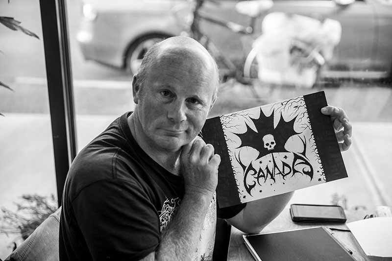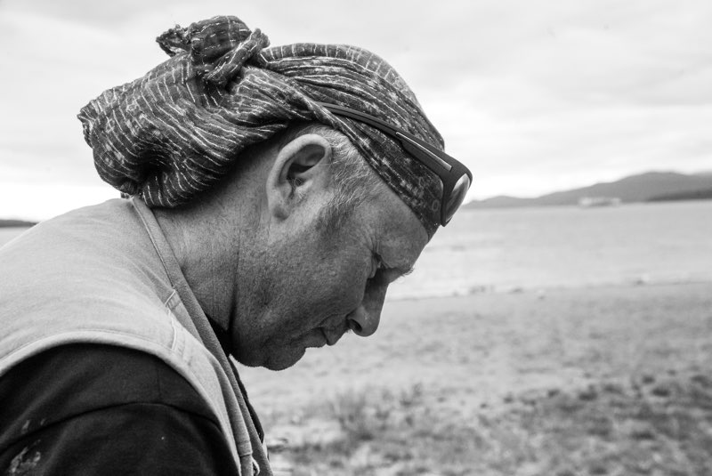
Within the world of extreme music, few names carry the same weight in visual identity as Christophe Szpajdel. Better known as the Lord of the Logos, he is the mind and hand behind some of the most iconic and arcane logos in the history of black metal and related underground movements. From Emperor and Borknagar to Enthroned, Old Man’s Child, and countless others, Szpajdel’s work is as instantly recognizable as it iconic.
His logos are more than graphic design — they function as sigils, visual manifestations of sound, ideology, and atmosphere. For decades, his work has formed the aesthetic foundation upon which bands build their identity, often long before a single note is heard.
Your work is inextricably linked to the rise of black metal in the 1990s. How do you look back on that period today, both artistically and culturally?
I vividly remember the moment I was writing for a Belgian fanzine called Sepricore in the mid-90s. Around that time, I noticed a disturbing shift in the scene, driven by the unchecked surge of death metal bands, particularly emerging in Poland, Scandinavia, and South America. An unsettling energy was building up. Darker bands like Beherit, Blasphemy, Graveland, and Darkified—later known as Marduk—appeared alongside groups like Profanatica, Amputation, and Old Funeral, which eventually merged into Immortal and Darkthrone. These bands released black metal albums that far surpassed their earlier work, like Darkthrone’s “Soulside Journey.”
Classic acts such as Mercyful Fate, King Diamond, Venom, and Bathory regained popularity. At the same time,tragic events like Pelle Dead of Mayhem taking his own life cast a shadow over the scene. By the early 90s, the scene had shifted towards a much darker aesthetic, diverging from the original death metal’s focus on death and destruction to something more foreboding and intense.
This transformation accelerated after 1993, when Vikernes murdered Euronymous Aarseth, the leader of Mayhem and owner of Deathlike Silence Productions—home to bands like Dutch legends Asphyx, who were about to release “Embrace the Death,” and Polish giants Imperator, preparing to debut with “The Time Before Time.” Within just a few months in early 1991, a wave of black metal bands emerged, notably in Eastern Europe, South America, and even Malaysia, signalling a seismic shift in the underground metal landscape.

To what extent was your early visual language shaped by existing graphic traditions, and to what extent did it emerge intuitively within a subcultural context?
Drawing logos was something I embraced as early as the late 1980s, inspired by bands like Venom, Possessed, Protector, Celtic Frost, Necrovore, and others, because their striking visual imagery deeply resonated with me. However, in the early 1990s, I noticed many bands sporting amateurish logos, which motivated me to take action. While writing for the fanzine Septicore, I noticed that some bands needed a more powerful, cohesive visual identity. I used my intuitive abilities to identify the right moment and the right projects to contribute to.
This opportunity arose during a correspondence with Samoth (Thomas Haugen), who was growing tired of playing with his then-current bands, Xerasia and Embryonic, feeling that their style was too immature and did not align with his artistic ambitions. This marked a resurgence rooted in returning to the origins of black metal, then channelling it towards more elaborate, research-driven themes encompassing occultism, sorcery, witchcraft, forbidden knowledge, and dark arts. This evolution steered black metal toward a darker, more meaningful cultural expression, reminiscent of the early 1980s but now with a deeper, more intricate focus.
This renewed connection to the roots fostered an intensified exploration of symbolism, which was less prominent in the early death metal scene. By the mid-1990s, as death metal shifted towards groove-driven, more commercial sounds, I remained drawn to darker, more mysterious themes. This obsession with occult symbolism was further developed by bands such as the French Nehëmah, the Italian Mortuary Drape, Sinoath, the Dutch Bestial Summoning, the Austrian Belphegor, the Polish Pandemonium, the Ukrainian Nokturnal Mortum and Lucifugum, the German Desaster, the Spanish Akerbeltz, Blazemth, Xharathorn, Primigenium, Portuguese Paranormal Waltz, Filii Nigrantium Infernalium, and Decayed, Bulgarian Biophobia, Singaporean Impiety, Czech Törr, Root, Master’s Hammer, Romanian Negura Bunget, Hungarian Witchcraft, Ater Tenebrae, Turulver, Tormentor, Greek Rotting Christ, and Varathron.
These bands’ use of occult and esoteric symbolism truly spoke to me on a profound level. Over time, these symbols began to recur and gained increased attention, especially after notable events such as church burnings and the murder of Euronymous by Varg Vikernes. Around the year 2000, a new wave of bands like Wolves in the Throne Room, Krallice, and Vemod reignited my passion for exploration and creativity, stimulating my vivid imagination and amplifying my artistic expression. It was during this period that my involvement in logo design became more prominent and defined my creative identity.

Your logos from that era helped define the visual identity of an entire scene. Were you aware of that impact at the time?
Initially, I wasn’t fully aware that a single mistake could shape the visual identity of an entire scene, but I developed a sensefor it. This often happened because I was involved in designing many logos for various bands—many of which disappeared even before releasing an album, while others gained prominence. For example, I created the logo for Arcturus, which was inspired by the Enslaved logo designed by Jannicke Wiese Hansen. Interestingly, Borknagar includes Ivar Bjornsson, the guitarist and lead songwriter of Enslaved.
What role did handcraft, discipline, and repetition play in the formation of your signature style?
The discipline of handcrafting and repetition is entirely involuntary for me. When I draw a logo, I notice I often fall into patterns I’ve developed through countless quick sketches.
I naturally go with the flow, and unexpectedly, these patterns become part of my signature style. Nowadays, when presenting logos, I create numerous variations—such as solid black, outlined versions, drips, weapon motifs, splatters, or even 3-D textures achieved by layering a thin white pencil over black markers. I frequently make photocopies of finished bases to experiment with different finishes. Handcrafted discipline has become essential because I’ve never mastered digital work; I’ve always been resistant to computers, which seem to dislike me. As a result, I rely on my hands and collaborate with graphic designers who help translate my handmade artworks into digital formats.
They preserve the authenticity of my original creations while adapting them for various uses—whether on album covers, T-shirts, or embroidered patches.

Your work is now recognized both within subcultures and within the contemporary art world. How do you navigate between these two contexts?
This is indeed a challenging yet highly relevant question. My work has garnered recognition within the contemporary art world, earning me several prestigious awards that honour my artistic legacy. ArtTour International magazine has named me one of the top 60 masters, and this year I will showcase my insights at the Pulse Film Festival in Antwerp on January 22nd, where I will participate in artist talks and workshops focused on designing effective branding and enhancing marketability for logos.
The organisation behind my international accolades is Fondazione Effetto Arte, which has honoured me with awards comparable to those given to legends such as Poseidon, Velázquez-Goya, Leonardo da Vinci, and Universal Genius. I also participated in Devon’s Open Studios, an annual event across Devon County in the UK, held every September. Additionally, I have exhibited consecutively in Plymouth for two years.
Looking ahead, I am eager to explore new horizons, including the possibility of participating in the Sitges Film Festival near Barcelona. Despite this, I remain deeply attached to music festivals, where my art resonates most authentically with its core concepts. I find it easy to navigate between these two worlds, as I continuously work to increase my visibility and stay adaptable. Being flexible and versatile, able to shift seamlessly between different contexts, is vital to reaching a broader audience.
To be continued……

